
01
Challenges
The problem of online searching for relevant job is still in. Candidates cannot find a position that meets their criteria, but recruiters have similar problems with employees' selection. Usually in the classical management system, at the preliminary stage the recruiter needs to select the top five candidates.
Each applicant passes the first round of interviews. And then the interview with the best candidate. And so that an interview with a candidate can cost the company thousands of dollars. In case the resume was poorly chosen then the search may be delayed. On the other part, from candidates discrepancy between the search and the position leads to the fact that the applicant loses all interest.

02
research
Getting start to the research, I decided to find challenges that people face when applying for a job. For this, I looked at several thematic communities in social networks . To build realistic user stories, I interviewed 10 people between the ages of 22 and 32 who are looking for a job, and also who are looking for a job change.
The global issue for users was a barriers that they faced when looking for work. Based on user interviews were concluded:five people said that the search results do not meet their interests, three said that the search is partially satisfied but the amount of interviews is insufficient, and two said that are completely satisfied with the search, but would like feedback from recruiters.
When I continued my research, I decided to contact with a recruitment company and asked their. And the global issue in my interview was what influences for a decision-facktor. Recruiters distinguish the following: the experience of the applicant, his education and position compliance.
03
personas
Based on the research above, I have identified 4 people who have different needs. This data will be useful to improve the user experience of each one of them.
The aim would be been to create the best itinerary and improve the functionalities to provide the best possible experience for each persona.

Tobias Page
Student
20 Years Old
Needs
- Search for internships
- Opportunity to work and study
Pain Points
- Developing resume
- Filling out applications takes time
- Too short time to apply for an internship

Cesar Luna
Project Manager
36 Years Old
Needs
- Find meaningful and stable job
- It is important to know reviews about the company
Pain Points
- Selection of relevant vacancies
- There is no time to understand the search settings

Hubert Cummings
Freelance Writer
30 Years Old
Needs
- Increase interactions with companies
- Reach new audience
- Maintaining contacts
Pain Points
- Unreliable Clients
- Struggles for the interviews

Kristy Hamilton
Recruter
38 Years Old
Needs
- Search candidates for open vacancies
- Conduct interviews with candidates
- Feedback from candidates at all stages
Pain Points
- Takes time and effort to lern a new tool
- Qualification of candidates does not always meet to vacancies
04
pain points
Summarising the research I’ve discussed, I have develop the following considerations:
- Job-feed formed in the form of a list may not be informative.
- Using a large amount of information at the application stage distracts users ' attention
05
Solutios
After receiving the results of the pain points, I started to solve these problems in such a way that it generally had a positive impact on the user experience.
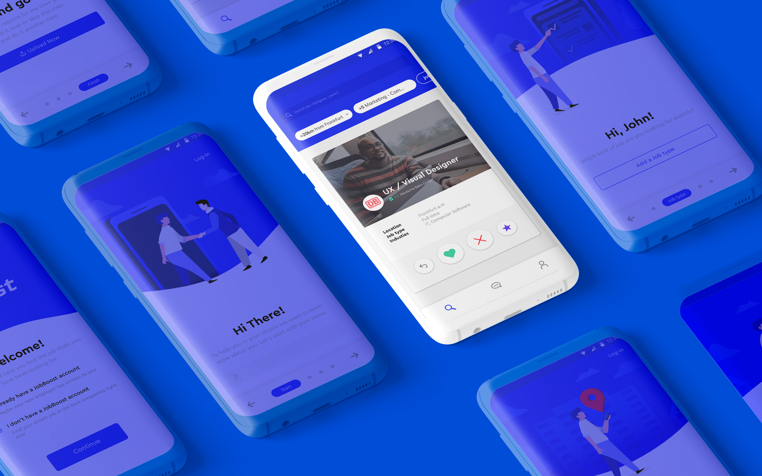
Onboarding
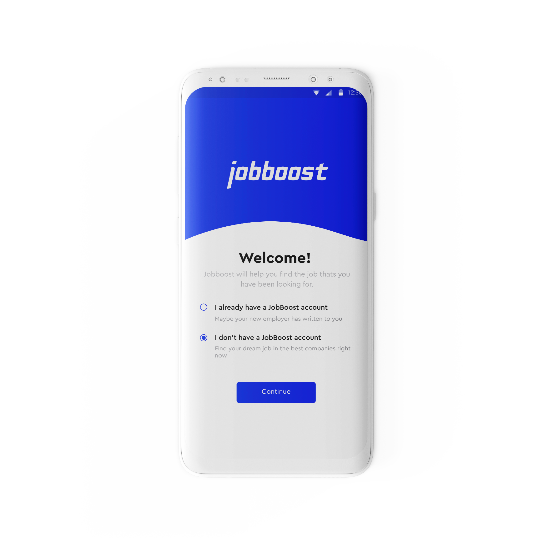
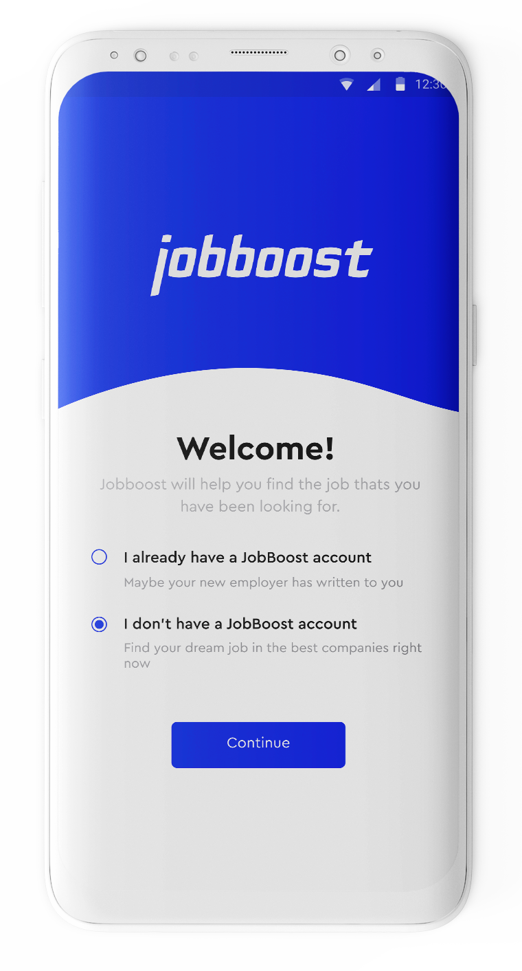
The main value of the onboarding process needs to serve, is to set initial expectations from the app, and to get the minimum information we need from the user in order to get started.
I did this by showing a simple walkthrough and used forms that are as frictionless as possible with no need to type.
Homescreen
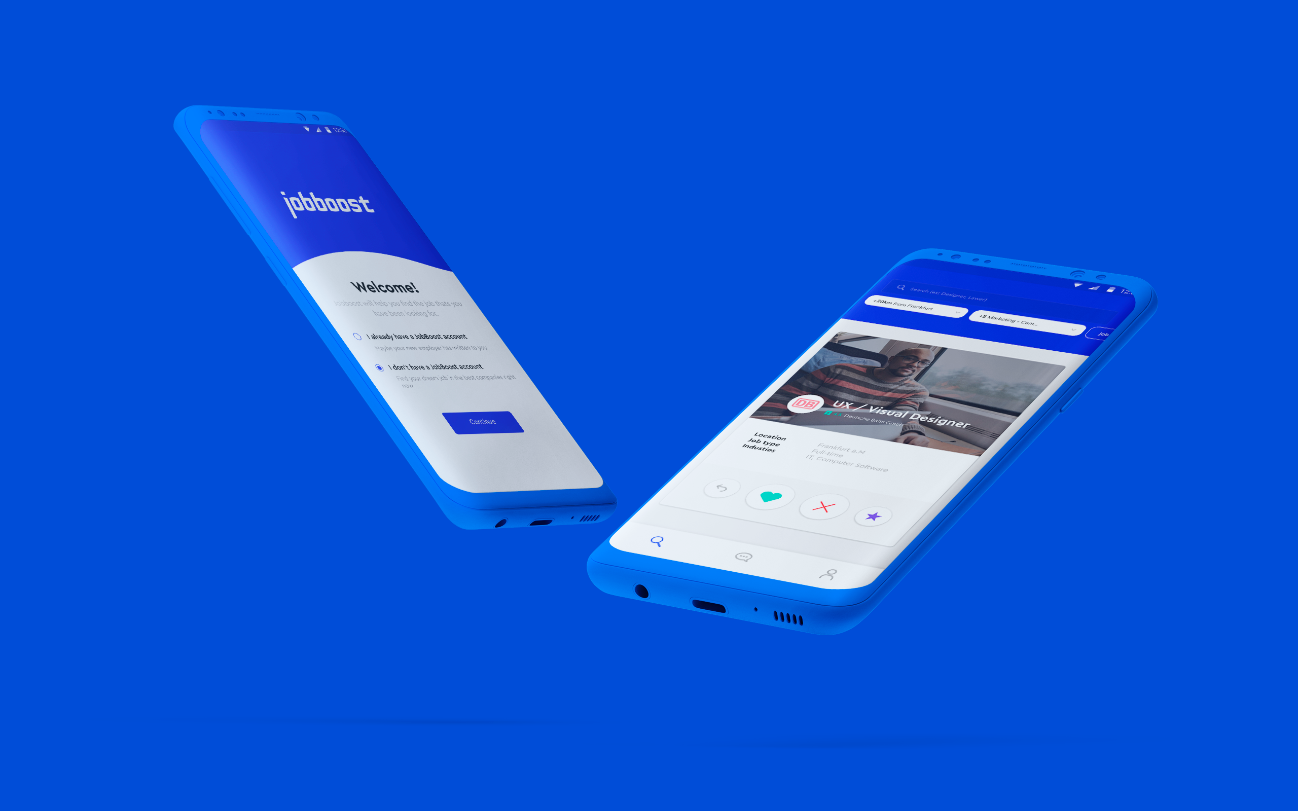
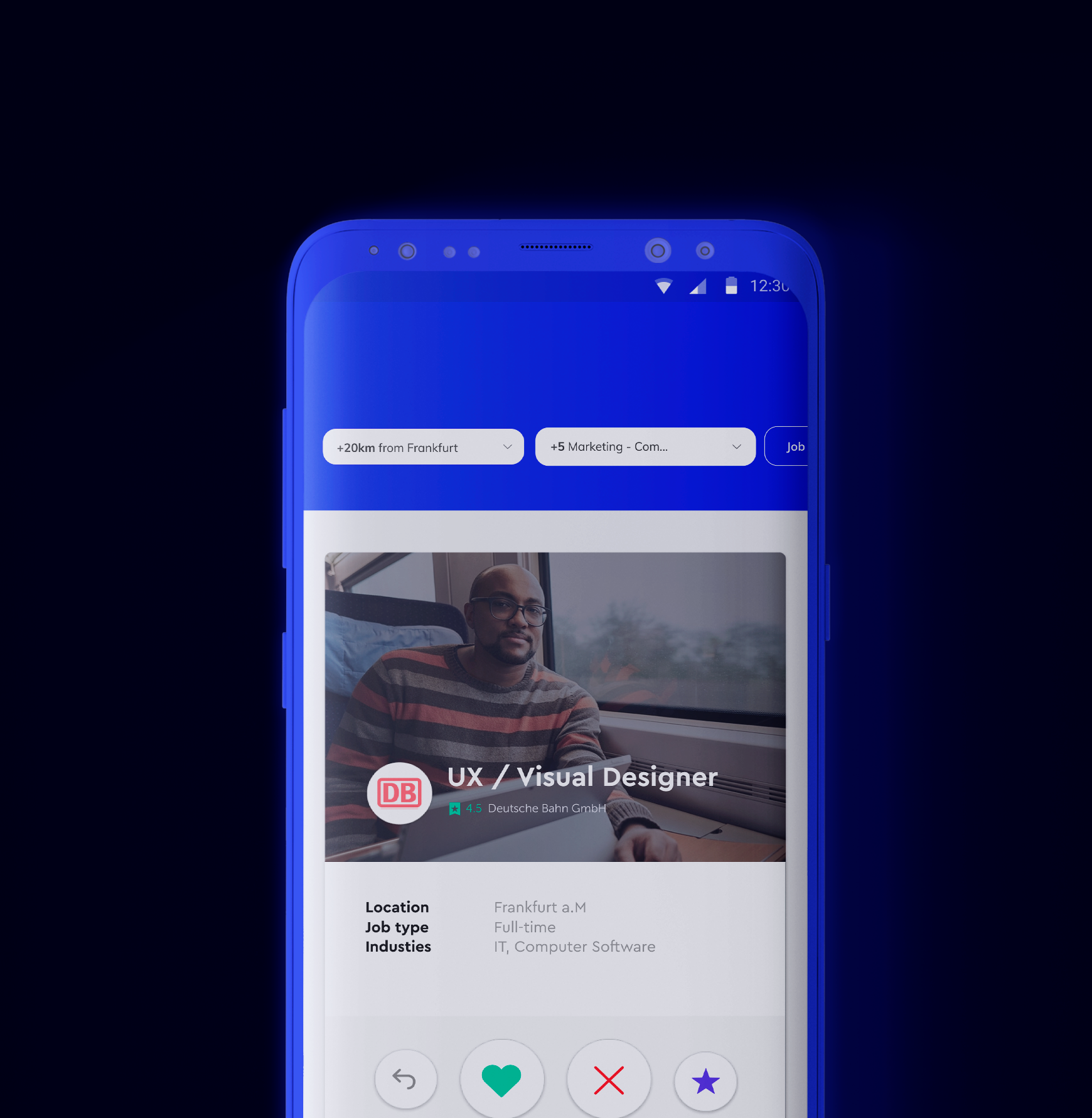
In an attempt to solve the pain points, a card system was used on the main screen.
So the user is involved in the application process and at the same time the application becomes easier
Navigation
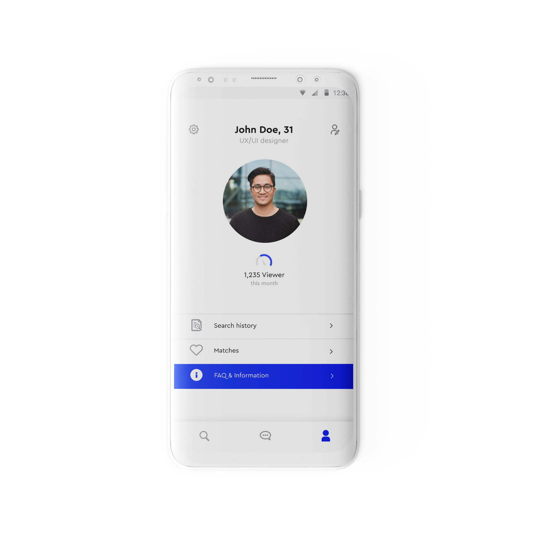
I designed the navigation in this way that not to overload the user's attention.
Therefore, I used the tab bar so that the user can quickly access the necessary sections.
Search
The search principles have been rethought because it is now based on resume data.
The data entered should complement artificial intelligence. After that, the automatic selection gives more compatible positions
Online CV
Due that the CV can be downloaded from the file and the app recognizes and automatically fills in all necessary fields.
Therefore, everything simple works, when you do not need to long attend training to use product.
06
Conclusion
Due the interaction for cards helped to organize the order and dispersion of information.As user tests have shown, this helped solve the problem of navigation and engagement.Also can positively assess the AI system of selection of vacancies.
